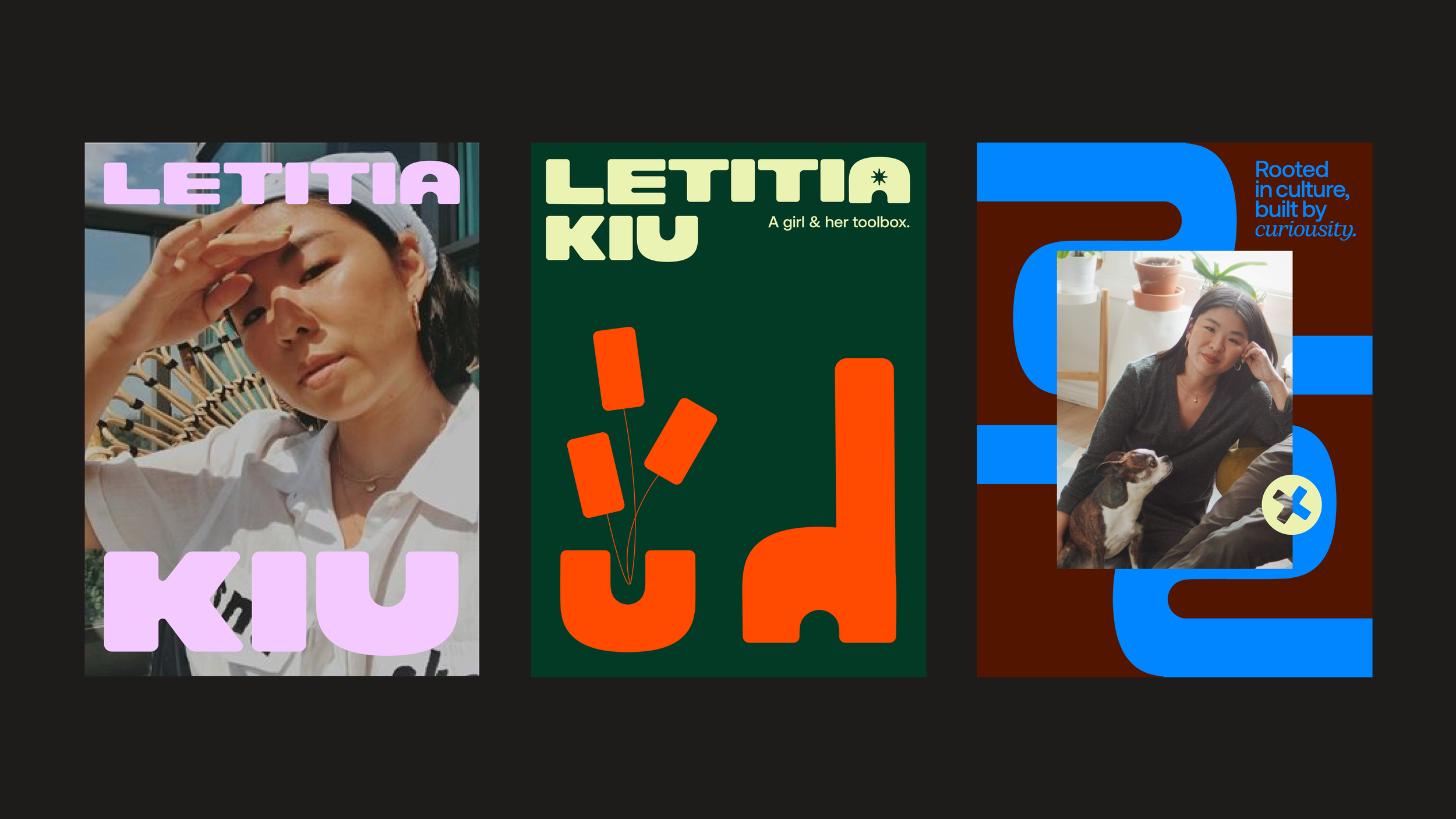
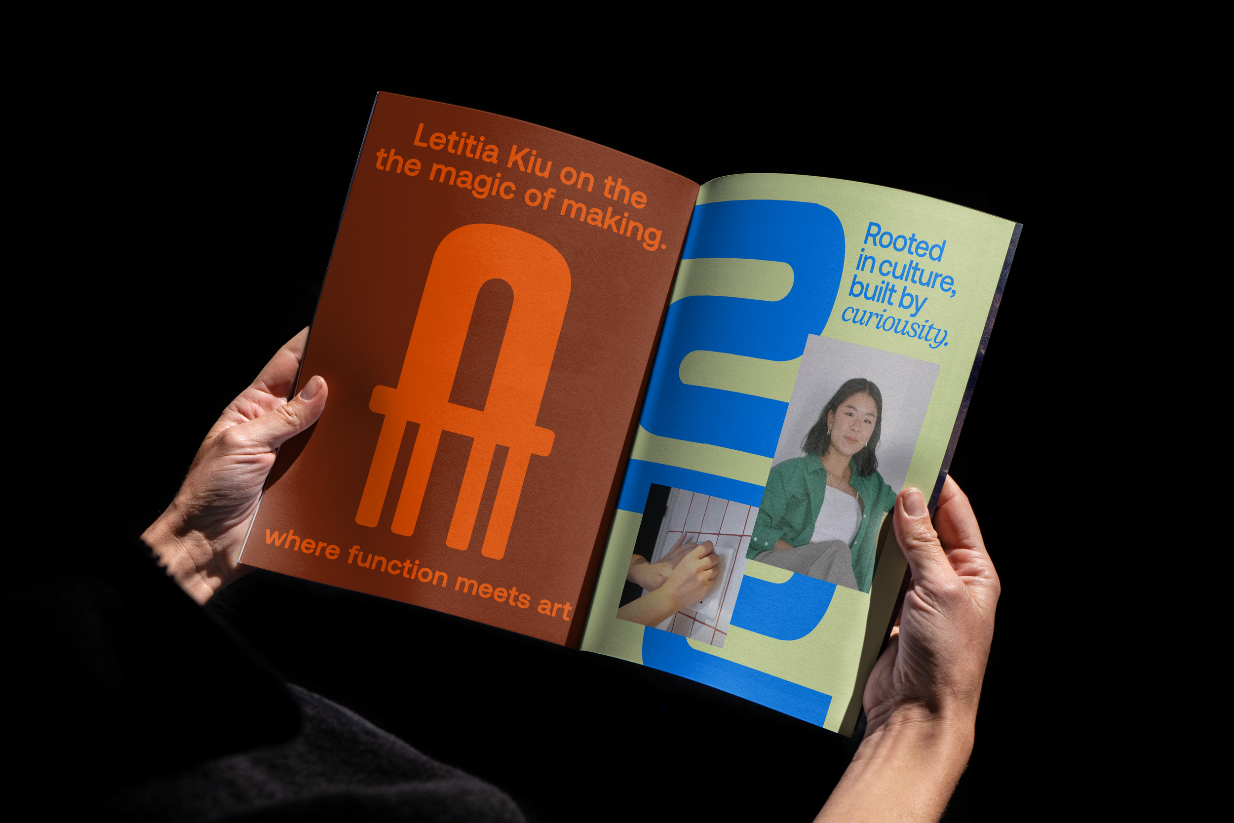
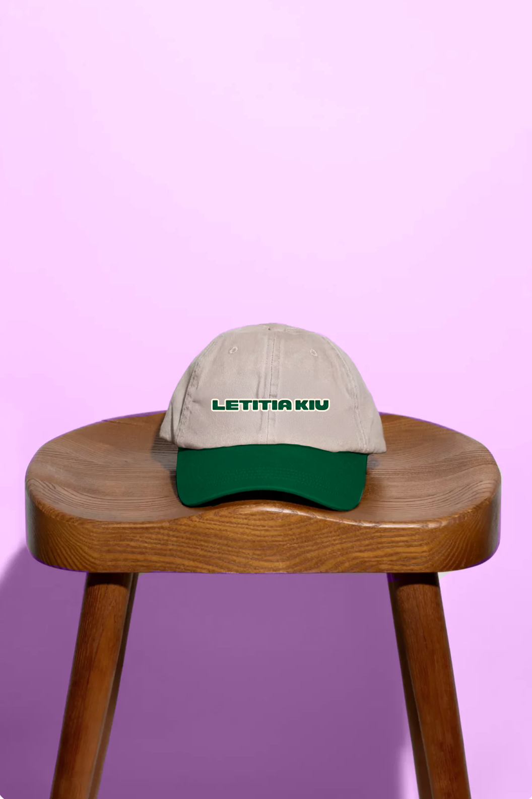
LETITIA KIU
A Toronto-based DIY creator redefining femininity in the maker space, Letitia needed a brand with both grit and grace. I crafted a bold, flexible identity that celebrates imperfection, culture, and creative joy—empowering women of colour to build unapologetically and take up space.
Brand System Overview
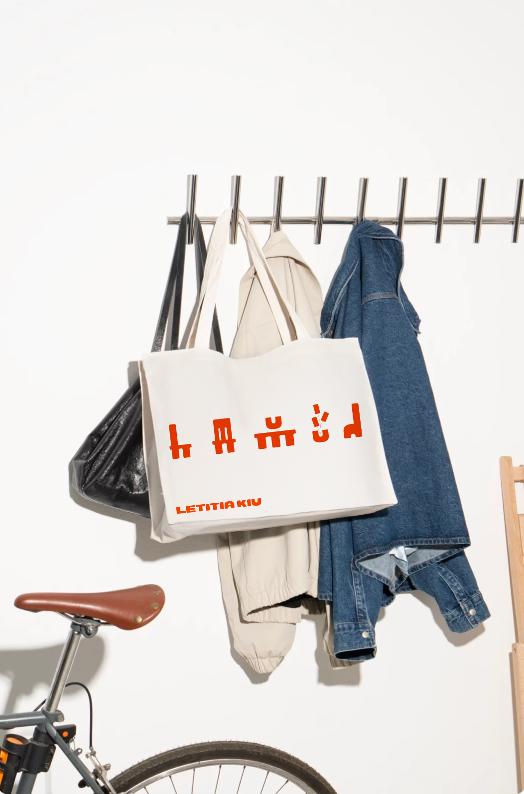
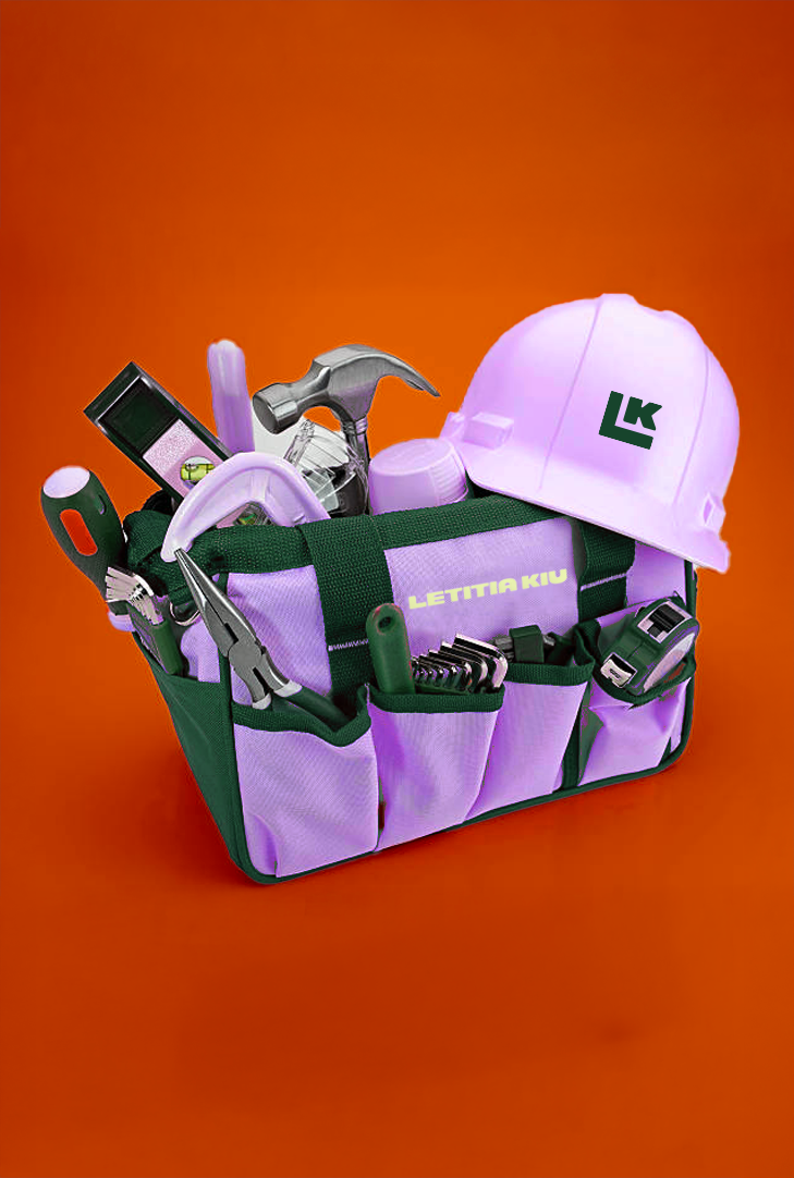
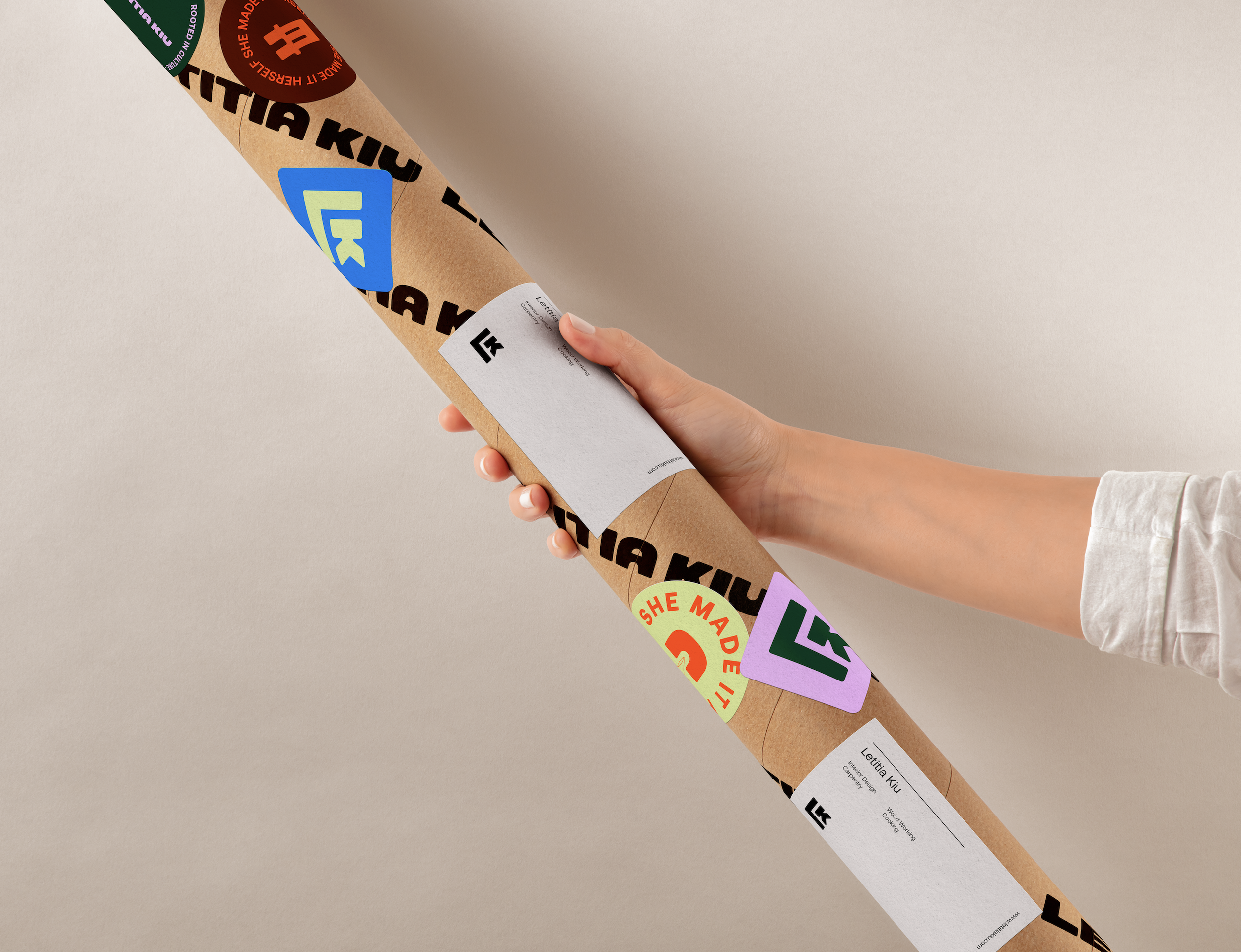
Logo & Iconography
Colour Palette
Graphic System: Screw-head Forms
Graphic System: Furniture Forms
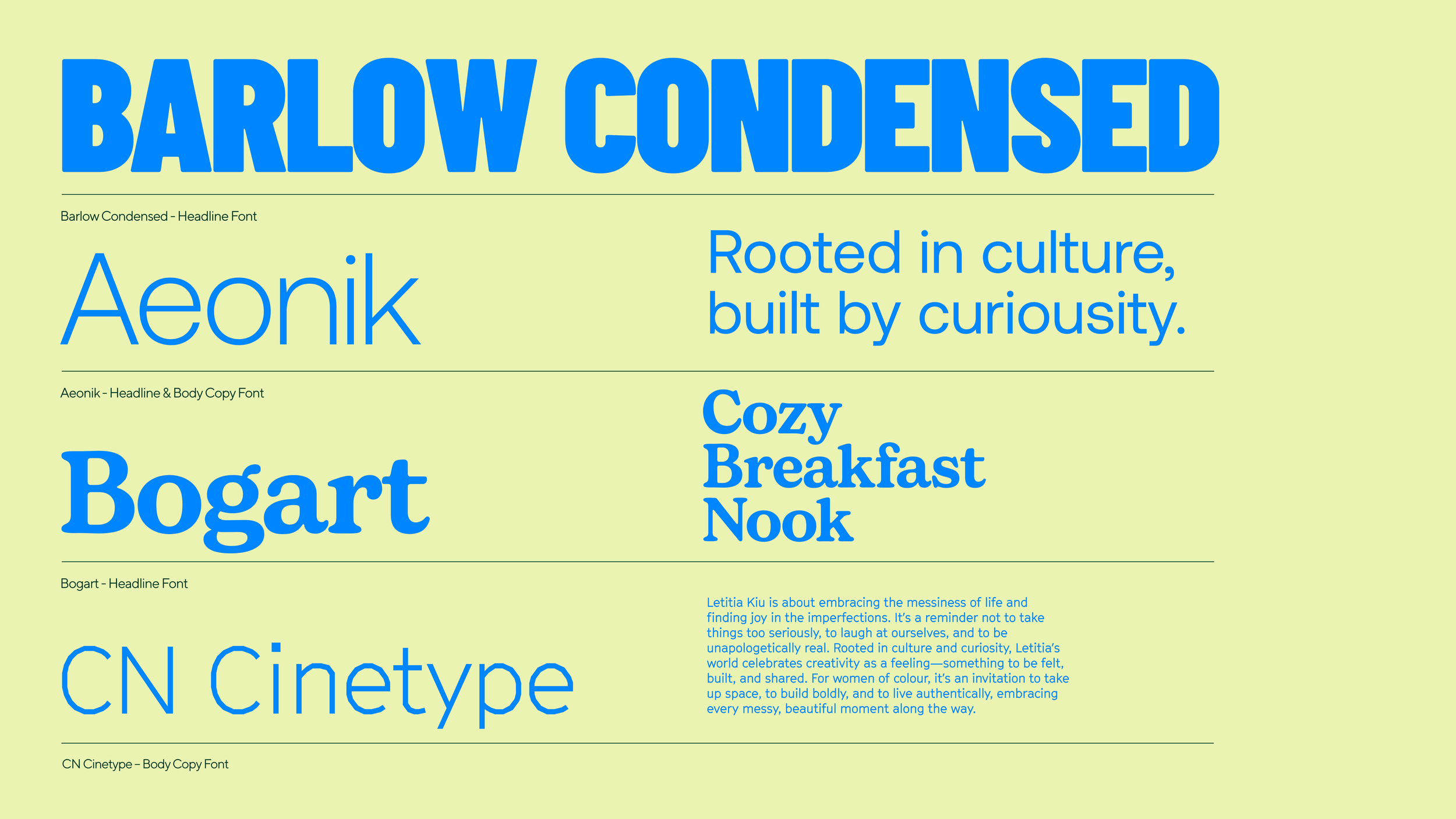
Typography
Brand Tone
WHO IS
LETITIA KIU
-
Letitia Kiu uplifts women—especially women of colour—by encouraging them to take on DIY and build spaces of their own, confidently and unapologetically.
-
Letitia’s content embraces joy and experimentation. Her approach is approachable, filled with humour, real-life mistakes, and a lighthearted take on home improvement and creativity.
-
Letitia keeps it honest—sharing both the triumphs and the challenges. Her tone is raw, real, and refreshingly imperfect, making DIY feel more human and accessible.
A bold, evolving
identity built for impact.
Vibrant, experimental, and designed to flex across platforms—this system empowers Letitia’s brand to grow with her, from YouTube to beyond.


Motion that builds—
just like her projects.
Inspired by the movement of making, crafting and curating, the motion language brings her world to life—piece by piece, joyfully in hand-rendered motion.